
How do I use the Text widget?
How to access the Text widget
In order to access the Text widget:
- Go to the page in your course where you'd like to add this widget.
- Select Edit mode.
- In the lefthand widget menu, click on the Text widget icon (or you can hold and drag it wherever you'd like on the page).

How to set up the Text widget
By clicking on the Text tab you will see how the content you have added to this widget will appear in the course.

After adding the text widget, you can click on the Setup tab. You will see icons and menus resembling a simple text editor.
Let's dive into all the menus and icons to see what they offer!
The tabs/menus
There are 4 tabs you will see on the top:
- Edit
- Insert
- Table
- View
In the second line, you will see Formats followed by a number of icons as on the screenshot below:

Edit
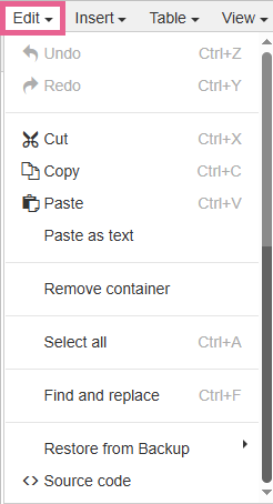
- Undo: Undo the last action.
- Cut: Cut the selected content.
- Copy: Copy the selected content.
- Paste: Paste the previously selected content into the widget.
- Paste as text: Paste the previously selected content into the widget as text.
- Remove container: To remove the container.
- Select all: Select all content in the text widget.
- Find and replace: Find a word or a phrase.
- Restore from Backup: Revert to one of the previous versions of the content.
- Source code: View, edit or write the source code.
 Protip: For advanced HTML code editing, use the HTML code widget instead. See How do I use the HTML code widget? How do I embed HTML code?
Insert

- Special character: Insert special characters simply by clicking on one in the chart.

- Latex: To be discontinued, please use Equation.
- Equation: This can be used to enter mathematical equations. To create one, you can:
a) point-and-click on the board
 or
or
b) if you're familiar with syntax, type and edit the green text:

- Paragraph divider: Inserts a line between the paragraphs.
- Nonbreaking space: Prevents an automatic line break at its position and prevents consecutive whitespace characters from collapsing into a single space.
Table

- Table: Insert table by dragging the mouse across the chart to choose the number of columns and lines.
- Table properties: You can choose additional table properties, such as width, height, border, etc.


- Delete table: Delete the selected table.
- Cell: Set up additional cell properties, merge or split cells.
- Row: Set up additional row properties, delete, insert, cut, copy and paste rows.
- Column: Insert or delete column.
View

- Show invisible characters: This shows invisible characters, such as spaces.
Formats
- Headings

- Header 1-4: Defines the level of headings for the selected text.
- Body: Sets the selected text to the "default" font size.
- Inline

- Bold: Changes the text style to bold.
- Italic: Changes the text style to italic.
- Underline: Underlines the selected text.
- Strikethrough: Places a horizontal line over the selected text.
- Superscript: Specifies selected text to be displayed as superscript.
- Subscript: Specifies selected text to be displayed as a subscript.
- Code: Displays the selected text as computer code.
- Citation: This is used to describe a reference to a cited creative work, and must include the title of that work. The reference may be in an abbreviated form according to context-appropriate conventions related to citation metadata.
Example:

User view:

- Special

- Spoiler: Creates a special element that reveals hidden text upon clicking.

The instructions (Click to Reveal) can be edited in Source code. Click Edit > Source code.
- Container: Creates a container that can be used to emphasize a part of the page content. The background can be edited. (Here's how.)
- Code block: Can be used to display code.
- Blocks

- Paragraph: Reverts to default text paragraph style settings.
- Blockquote: This can be used to indicate that the text is an extended quotation.
Example of learner view:

- Div: Defines a division or a section.
- Pre: Defines preformatted text. The selected text is displayed in a fixed-width font, and the text preserves both spaces and line breaks. The text will be displayed exactly as written in the HTML source code. You can use this to display code or any type of text where you would not want the lines to break.
The icons
Insert/Edit image
You can use this to insert (or edit) images in the course page. You can either upload it or enter the URL of the image that is located somewhere else.

- To upload the file click on the grey area where it says Select a file.
- To insert an image residing elsewhere click on enter a URL.
- You can set dimensions by setting max-width and height.
- For citation purposes, you can enter Display text and Link to the source.
Click OK when done.

Alt text: You can enter a brief description for people who can't see the image.
Long description: You can provide a description for complex images.

Course images: The images you had previously uploaded to the course are displayed here. In case you need to use the same image again, you can select it here instead of uploading it again.

By ticking the box you can apply different styles to the selected image.
Insert/Edit link
By clicking on this icon, you can insert a link to a page or a media file.

URL: Enter the page URL or click the icon to upload the image file.
This file is a download: Tick the box if you'd like the file to download to a computer rather than open it in the browser.
Text to display: You can edit the text you'd like to display.
Hover text: The text that the user will see when they hover over the link.
Open in: New window / Same window
Style: Standard / Never underlined / Always underlined
Insert/Edit media

Media URL/Link: Link the media you'd like to embed within your Text widget.
Dimensions: You can set the height and width of the media.
Full-Width: Tick this box if you'd like the media to be full-width
Play Automatically: Tick this box if you'd like the media to play automatically when the learner lands on this page
Text styling

Bold - Changes the selected text to bold.
Italic - Changes the selected text to italic.
Underline - Underlines the selected text.
Text colour - Change the colour of the text.
Bullet list or numbered list

These two can be used to create a bulleted or numbered list.
Indent and alignment

These can be used to decrease and increase ident and change the alignment of the text.
Clear formatting
Selecting text and clicking this icon will remove any formatting.
Completion settings
Completing activities on a page is how learners make progress and receive their certificates or complete the course.
As the administrator, you can modify how each widget tracks this progress.
To do this, click on the Completion Settings tab on the widget and choose one of the following options:

No completion tracking: This widget will not count towards completion.
Completed when viewed: This widget will count as completed as soon as the Learner views it.
Completed when scrolled to ...: This widget will count as completed once the Learner has viewed up to the point of the widget you have set in this section. Normally you would use this setting for longer pieces of text.
1 reply
-
Bermanfaat